I can think of only one bridge with a color in it’s name.
If I were to visit San Francisco without having seen a photo of the Golden Gate Bridge, I might imagine I’d see a bridge the warm color of a Gold Retriever, or the vivid yellow of McDonald’s Golden Arches, or shiny like a Golden Globe statue.
I might be surprised then to find the iconic bridge is…..reddish orange? And it’s been this color since it opened in 1937.

Golden Gate Bridge, San Francisco, California by kconnors
If you’ve ever chosen a paint color for a room or a house, you know how challenging it can be. I once came home to a yellow bedroom that almost made me cry because it was gaudy and clashed with the carpet. Tasked with studying and selecting the color for the Golden Gate Bridge, in 1935, Irving F. Morrow an architect on the project submitted a 14-page report plus many letters of support for the color selection you see today; three possible alternative colors were considered: black, aluminum and gray.
When the bridge was built, the towers were already primed in a color similar to the one you see today, but this wasn’t purposely done. Area residents like Lillian Hodgehead were watching how this color worked with the landscape and liked it. She wrote in support of the color she saw,
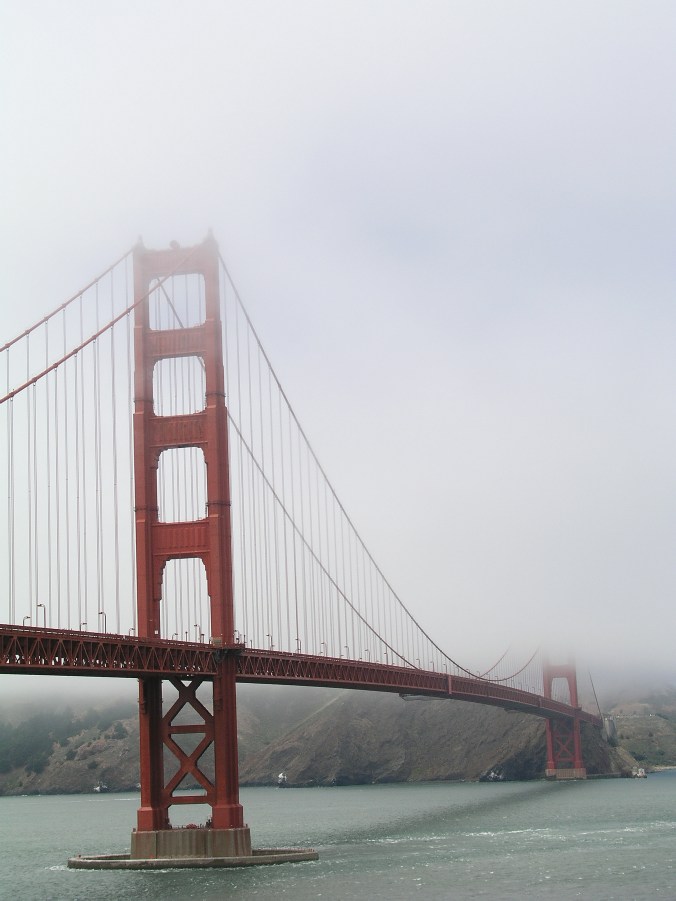
The name of the bridge’s paint color is International Orange. This was determined to be just the right color for this enormous structure because it “blended well with nearby hills and contrasted with the ocean and sky.”
Ahhhhh. That’s why the scene above is so spectacular. And so is this foggy one.
Golden Gate Bridge, San Francisco, California by kconnors
While I’d imagine the Golden Gate Bridge to be painted something other than International Orange, I don’t think any other color would do.
